|
| GimpChat Member |
 |
Joined: May 16, 2010
Posts: 14709
Location: USA
|
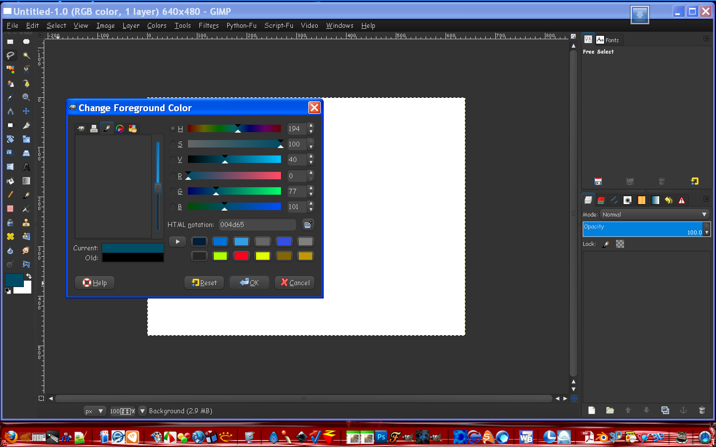
Partha one thing i did notice is that Aurora still doesn't work well with images in the previews for layers, brushes and gradients and stuff. I switched the theme to Aurora-Midnight-0.1 and it is exactly the same color theme except it works.  Here are the 2 different gtkrc files. Aurora-Midnight-0.1 # ===[ buttons ]===
# the prelight of toggle buttons is darkened slightly
#
# ===[ scroll bars ]===
# bg[ACTIVE] is trough color
# bg[NORMAL] & bg[NORMAL] are scrollbar colors
# ===[ check and radio buttons ]===
# bg[SELECTED] is the selected background colour
# text[SELECTED] is the selected check/circle color
# text[INSENSITIVE] is the disabled check/circle colour
# base[*] is used for all other background states
# --on prelight the bg is lightened slightly
# --bg is lightened slightly when check/radio not drawn (for all states)
#default color scheme
gtk_color_scheme = "fg_color:#D4D4D4\nbg_color:#333333\nbase_color:#474747\ntext_color:#D4D4D4\nselected_bg_color:#0081DE\nselected_fg_color:#ffffff"
gtk-menu-popup-delay = 50
style "theme-default"
{
GtkButton::default_border = { 0, 0, 0, 0 }
GtkButton::child-displacement-x = 0
GtkButton::child-displacement-y = 1
#GtkWidget::focus-padding = 0
GtkRange::trough-border = 0
GtkRange::slider-width = 19
GtkRange::stepper-size = 17
GtkScrollbar::min_slider_length = 30
GtkScrollbar::has-secondary-backward-stepper = 1
GtkPaned::handle_size = 8
GtkMenuBar::internal-padding = 0
GtkTreeView::expander_size = 13 #15
GtkExpander::expander_size = 13 #17
GtkScale::slider-length = 25
GtkScale::slider-width = 17
GtkScale::trough-border = 0
GtkWidget::link-color = "#0062dc" # blue
GtkWidget::visited-link-color = "#8c00dc" #purple
WnckTasklist::fade-overlay-rect = 0
WnckTasklist::fade-loop-time = 5.0 # 5 seconds
WnckTasklist::fade-opacity = 0.5 # final opacity
#makes menu only overlap border
GtkMenu::horizontal-offset = -1
#removes extra padding at top and bottom of menus. Makes menuitem overlap border
GtkMenu::vertical-padding = 0
#set to the same as roundness, used for better hotspot selection of tabs
GtkNotebook::tab-curvature = 3
GtkNotebook::tab-overlap = 4
GtkMenuItem::arrow-spacing = 10
#Spacing between edge with indicator and text
GtkOptionMenu ::indicator-size = {11, 5}
#GtkOptionMenu ::indicator-spacing = {6, 5, 4, 4}
GtkCheckButton ::indicator-size = 15
GtkCheckButton ::indicator-spacing = 1
GtkRadioButton ::indicator-size = 15
GtkTreeView::horizontal_separator = 2
GtkTreeView::odd_row_color = mix(0.98, shade (0.93,@base_color), @selected_bg_color)
GtkEntry::cursor_color = @text_color
GtkTextView::cursor_color = @text_color
GtkScrolledWindow::scrollbar-spacing = 0
GtkScrolledWindow::scrollbars-within-bevel = 1
xthickness = 1
ythickness = 1
fg[NORMAL] = @fg_color
fg[ACTIVE] = @fg_color
fg[PRELIGHT] = @fg_color
fg[SELECTED] = @selected_fg_color
fg[INSENSITIVE] = @selected_fg_color
bg[NORMAL] = @bg_color
bg[ACTIVE] = shade (1.025,@bg_color)
bg[PRELIGHT] = shade (1.10,@bg_color)
bg[SELECTED] = @selected_bg_color
bg[INSENSITIVE] = shade (1.025,@bg_color)
base[NORMAL] = @base_color
base[ACTIVE] = shade (0.65,@base_color)
base[PRELIGHT] = @base_color
base[SELECTED] = @selected_bg_color
base[INSENSITIVE] = shade (1.025,@bg_color)
text[NORMAL] = @text_color
text[ACTIVE] = shade (0.65,@text_color)
text[PRELIGHT] = @text_color
text[SELECTED] = @selected_fg_color
text[INSENSITIVE] = shade (1.70,@bg_color)
engine "aurora"
{
menubarstyle = 2 # 0 = flat, 1 = gradient, 2 = sunken
curvature = 6.2
arrowsize = 1 # controls combo_arrow circle size. Diameter set by (11 + 2 * arrowsize)
old_arrowstyle = FALSE #set to TRUE for original circled arrows
animation = TRUE # FALSE = disabled, TRUE = enabled
}
}
style "theme-wide" = "theme-default"
{
xthickness = 2
ythickness = 2
}
style "theme-wider" = "theme-default"
{
xthickness = 3
ythickness = 3
}
style "theme-widest" = "theme-default"
{
xthickness = 4
ythickness = 3
}
style "theme-button" = "theme-widest"
{
bg[NORMAL] = shade (1.35,@bg_color)
bg[ACTIVE] = shade (0.85,@bg_color)
bg[PRELIGHT] = mix(0.60, shade (1.35,@bg_color), @selected_bg_color)
#for arrows
text[SELECTED] = shade (0.75,@selected_fg_color)
}
style "theme-entry" = "theme-button" {
xthickness = 4
ythickness = 4
}
style "theme-frame" = "theme-wide"
{
GtkWidget::draw-border = {1,1,1,1}
}
style "theme-toolbar" = "theme-default"
{
bg[NORMAL] = shade (1.2,@bg_color)
}
style "theme-handlebox" = "theme-default"
{
bg[NORMAL] = shade (0.95,@bg_color)
}
style "theme-scale" = "theme-default"
{
bg[NORMAL] = shade (1.50,@bg_color)
bg[PRELIGHT] = shade (1.90,@bg_color)
}
style "theme-range" = "theme-wide"
{
bg[NORMAL] = shade (1.35,@bg_color)
bg[PRELIGHT] = mix(0.70, shade (1.35,@bg_color), @selected_bg_color)
#Arrows
text[PRELIGHT] = @selected_fg_color
text[ACTIVE] = shade (0.30,@selected_fg_color)
text[INSENSITIVE] = shade (0.60,@bg_color)
}
style "theme-notebook" = "theme-wider"
{
bg[NORMAL] = shade (1.10,@bg_color)
fg[ACTIVE] = shade (0.6,@fg_color)
bg[ACTIVE] = shade (0.90,@bg_color)
bg[SELECTED] = mix(0.70, @selected_bg_color, shade (1.10,@bg_color))
}
style "theme-paned" = "theme-default" {
bg[NORMAL] = shade (1.1,@bg_color)
bg[PRELIGHT] = shade (1.2,@bg_color)
}
style "theme-menu" = "theme-default"
{
xthickness = 0
ythickness = 0
bg[NORMAL] = shade (1.11627907,@bg_color)
bg[NORMAL] = shade (0.6,@bg_color)
}
style "theme-menu-item" = "theme-wider"
{
fg[PRELIGHT] = @selected_fg_color
text[PRELIGHT] = @selected_fg_color
}
style "theme-menubar" = "theme-default" {
bg[NORMAL] = shade (0.7,@bg_color)
}
style "theme-menubar-item" = "theme-menu-item" {}
style "theme-tree" = "theme-default"
{
xthickness = 2
ythickness = 1
GtkWidget::focus-padding = 0
bg[NORMAL] = shade (1.1,@bg_color)
bg[PRELIGHT] = shade (1.75,@bg_color)
bg[ACTIVE] = mix(0.65, shade (1.1,@bg_color), @selected_bg_color)
}
style "theme-tree-arrow" = "theme-default"
{
bg[NORMAL] = mix(0.70, shade (0.75,@bg_color), shade (0.80,@selected_bg_color))
bg[PRELIGHT] = mix(0.80, @bg_color, @selected_bg_color)
}
style "theme-tooltips" = "theme-widest"
{
bg[NORMAL] = shade (0.80,@selected_bg_color)
fg[NORMAL] = @selected_fg_color
}
style "theme-progressbar" = "theme-default"
{
xthickness = 2
ythickness = 2
bg[NORMAL] = shade (1.4,@bg_color)
fg[PRELIGHT] = @selected_fg_color
}
style "theme-combo" = "theme-button" {
GtkButton::inner-border = { 0, 1, 0, 0 }
xthickness = 4
ythickness = 4
}
style "theme-combo-box" = "theme-button" {
xthickness = 4
ythickness = 2
}
style "theme-combo-arrow" = "theme-button"
{
xthickness = 1
ythickness = 1
text[SELECTED] = shade (0.8, @selected_fg_color)
}
style "theme-view" = "theme-default"
{
xthickness = 0
ythickness = 0
}
style "theme-check-radio-buttons" = "theme-button"
{
GtkWidget ::interior-focus = 0
GtkWidget::focus-padding = 1
text[SELECTED] = @selected_fg_color
}
# widget styles
class "GtkWidget" style "theme-default"
class "GtkScale" style "theme-scale"
class "GtkRange" style "theme-range"
class "GtkPaned" style "theme-paned"
class "GtkFrame" style "theme-frame"
class "GtkMenu" style "theme-menu"
class "GtkMenuBar" style "theme-menubar"
class "GtkEntry" style "theme-entry"
class "GtkProgressBar" style "theme-progressbar"
class "GtkToolbar" style "theme-toolbar"
class "GtkSeparator" style "theme-wide"
widget_class "*<GtkMenuItem>*" style "theme-menu-item"
widget_class "*<GtkMenuBar>.<GtkMenuItem>*" style "theme-menubar-item"
widget_class "*<GtkButton>" style "theme-button"
widget_class "*<GtkCheckButton>" style "theme-check-radio-buttons"
widget_class "*<GtkHandleBox>" style "theme-handlebox"
widget_class "*<GtkNotebook>" style "theme-notebook"
widget_class "*<GtkNotebook>*<GtkEventBox>" style "theme-notebook"
widget_class "*<GtkNotebook>*<GtkDrawingArea>" style "theme-notebook"
widget_class "*<GtkNotebook>*<GtkLayout>" style "theme-notebook"
widget_class "*<GtkNotebook>*<GtkViewport>" style "theme-notebook"
widget_class "*<GtkNotebook>.GtkLabel*" style "theme-notebook" #for tabs
# combobox stuff
widget_class "*<GtkCombo>*" style "theme-combo"
widget_class "*<GtkComboBox>*<GtkButton>" style "theme-combo-box"
widget_class "*<GtkComboBoxEntry>*" style "theme-combo"
widget_class "*<GtkSpinButton>*" style "theme-combo"
# tooltips stuff
widget "gtk-tooltip*" style "theme-tooltips"
# treeview stuff
widget_class "*<GtkTreeView>.<GtkButton>" style "theme-tree"
widget_class "*<GtkCTree>.<GtkButton>" style "theme-tree"
widget_class "*<GtkList>.<GtkButton>" style "theme-tree"
widget_class "*<GtkCList>.<GtkButton>" style "theme-tree"
#For arrow bg
widget_class "*<GtkTreeView>.<GtkButton>*<GtkArrow>" style "theme-tree-arrow"
widget_class "*<GtkCTree>.<GtkButton>*<GtkArrow>" style "theme-tree-arrow"
widget_class "*<GtkList>.<GtkButton>*<GtkArrow>" style "theme-tree-arrow"
#######################################################
## GNOME specific
#######################################################
widget_class "*.ETree.ECanvas" style "theme-tree" #evolution
widget_class "*.ETable.ECanvas" style "theme-tree" #evolution
style "panelbuttons" = "theme-button"
{
# as buttons are draw lower this helps center text
ythickness = 3
}
widget_class "*Panel*GtkToggleButton*" style "panelbuttons"
#nautilus search stripe and other specialties
style "extra-view" {
bg[NORMAL] = shade(0.6,@bg_color)
fg[NORMAL] = @selected_fg_color
}
#nautilus search stripe
widget "*.nautilus-extra-view-widget" style:highest "extra-view"
widget "*.nautilus-extra-view-widget.*.GtkLabel*" style:highest "extra-view"
widget "*.nautilus-extra-view-widget.*Button*.GtkLabel*" style:highest "theme-button"
Aurora-Midnight (doesn't work) - # ===[ buttons ]===
# the prelight of toggle buttons is darkened slightly
#
# ===[ scroll bars ]===
# bg[ACTIVE] is trough color
# bg[NORMAL] & bg[NORMAL] are scrollbar colors
# ===[ check and radio buttons ]===
# bg[SELECTED] is the selected background colour
# text[SELECTED] is the selected check/circle color
# text[INSENSITIVE] is the disabled check/circle colour
# base[*] is used for all other background states
# --on prelight the bg is lightened slightly
# --bg is lightened slightly when check/radio not drawn (for all states)
#default color scheme
gtk_color_scheme = "fg_color:#D4D4D4\nbg_color:#333333\nbase_color:#474747\ntext_color:#D4D4D4\nselected_bg_color:#0081DE\nselected_fg_color:#ffffff"
gtk-menu-popup-delay = 50
style "theme-default"
{
GtkButton::default_border = { 0, 0, 0, 0 }
GtkButton::child-displacement-x = 0
GtkButton::child-displacement-y = 1
#GtkWidget::focus-padding = 0
GtkRange::trough-border = 0
GtkRange::slider-width = 19
GtkRange::stepper-size = 17
GtkScrollbar::min_slider_length = 30
GtkScrollbar::has-secondary-backward-stepper = 1
GtkPaned::handle_size = 8
GtkMenuBar::internal-padding = 0
GtkTreeView::expander_size = 13 #15
GtkExpander::expander_size = 13 #17
GtkScale::slider-length = 25
GtkScale::slider-width = 17
GtkScale::trough-border = 0
GtkWidget::link-color = "#0062dc" # blue
GtkWidget::visited-link-color = "#8c00dc" #purple
WnckTasklist::fade-overlay-rect = 0
WnckTasklist::fade-loop-time = 5.0 # 5 seconds
WnckTasklist::fade-opacity = 0.5 # final opacity
#makes menu only overlap border
GtkMenu::horizontal-offset = -1
#removes extra padding at top and bottom of menus. Makes menuitem overlap border
GtkMenu::vertical-padding = 0
#set to the same as roundness, used for better hotspot selection of tabs
GtkNotebook::tab-curvature = 3
GtkNotebook::tab-overlap = 4
GtkMenuItem::arrow-spacing = 10
#Spacing between edge with indicator and text
GtkOptionMenu ::indicator-size = {11, 5}
#GtkOptionMenu ::indicator-spacing = {6, 5, 4, 4}
GtkCheckButton ::indicator-size = 15
GtkCheckButton ::indicator-spacing = 1
GtkRadioButton ::indicator-size = 15
GtkTreeView::horizontal_separator = 2
GtkTreeView::odd_row_color = mix(0.98, shade (0.93,@base_color), @selected_bg_color)
GtkEntry::cursor_color = @text_color
GtkTextView::cursor_color = @text_color
GtkScrolledWindow::scrollbar-spacing = 0
GtkScrolledWindow::scrollbars-within-bevel = 1
xthickness = 1
ythickness = 1
fg[NORMAL] = @fg_color
fg[ACTIVE] = @fg_color
fg[PRELIGHT] = @fg_color
fg[SELECTED] = @selected_fg_color
fg[INSENSITIVE] = @selected_fg_color
bg[NORMAL] = @bg_color
bg[ACTIVE] = shade (1.025,@bg_color)
bg[PRELIGHT] = shade (1.10,@bg_color)
bg[SELECTED] = @selected_bg_color
bg[INSENSITIVE] = shade (1.025,@bg_color)
base[NORMAL] = @base_color
base[ACTIVE] = shade (0.65,@base_color)
base[PRELIGHT] = @base_color
base[SELECTED] = @selected_bg_color
base[INSENSITIVE] = shade (1.025,@bg_color)
text[NORMAL] = @text_color
text[ACTIVE] = shade (0.65,@text_color)
text[PRELIGHT] = @text_color
text[SELECTED] = @selected_fg_color
text[INSENSITIVE] = shade (1.70,@bg_color)
engine "aurora"
{
menubarstyle = 2 # 0 = flat, 1 = gradient, 2 = sunken
curvature = 6.2
arrowsize = 1 # controls combo_arrow circle size. Diameter set by (11 + 2 * arrowsize)
old_arrowstyle = FALSE #set to TRUE for original circled arrows
animation = TRUE # FALSE = disabled, TRUE = enabled
}
}
style "theme-wide" = "theme-default"
{
xthickness = 2
ythickness = 2
}
style "theme-wider" = "theme-default"
{
xthickness = 3
ythickness = 3
}
style "theme-widest" = "theme-default"
{
xthickness = 4
ythickness = 3
}
style "theme-button" = "theme-widest"
{
bg[NORMAL] = shade (1.35,@bg_color)
bg[ACTIVE] = shade (0.85,@bg_color)
bg[PRELIGHT] = mix(0.60, shade (1.35,@bg_color), @selected_bg_color)
#for arrows
text[SELECTED] = shade (0.75,@selected_fg_color)
}
style "theme-entry" = "theme-button" {
xthickness = 4
ythickness = 4
}
style "theme-frame" = "theme-wide"
{
GtkWidget::draw-border = {1,1,1,1}
}
style "theme-toolbar" = "theme-default"
{
bg[NORMAL] = shade (1.2,@bg_color)
}
style "theme-handlebox" = "theme-default"
{
bg[NORMAL] = shade (0.95,@bg_color)
}
style "theme-scale" = "theme-default"
{
bg[NORMAL] = shade (1.50,@bg_color)
bg[PRELIGHT] = shade (1.90,@bg_color)
}
style "theme-range" = "theme-wide"
{
bg[NORMAL] = shade (1.35,@bg_color)
bg[PRELIGHT] = mix(0.70, shade (1.35,@bg_color), @selected_bg_color)
#Arrows
text[PRELIGHT] = @selected_fg_color
text[ACTIVE] = shade (0.30,@selected_fg_color)
text[INSENSITIVE] = shade (0.60,@bg_color)
}
style "theme-notebook" = "theme-wider"
{
bg[NORMAL] = shade (1.10,@bg_color)
fg[ACTIVE] = shade (0.6,@fg_color)
bg[ACTIVE] = shade (0.90,@bg_color)
bg[SELECTED] = mix(0.70, @selected_bg_color, shade (1.10,@bg_color))
}
style "theme-paned" = "theme-default" {
bg[NORMAL] = shade (1.1,@bg_color)
bg[PRELIGHT] = shade (1.2,@bg_color)
}
style "theme-menu" = "theme-default"
{
xthickness = 0
ythickness = 0
bg[NORMAL] = shade (1.11627907,@bg_color)
bg[NORMAL] = shade (0.6,@bg_color)
}
style "theme-menu-item" = "theme-wider"
{
fg[PRELIGHT] = @selected_fg_color
text[PRELIGHT] = @selected_fg_color
}
style "theme-menubar" = "theme-default" {
bg[NORMAL] = shade (0.7,@bg_color)
}
style "theme-menubar-item" = "theme-menu-item" {}
style "theme-tree" = "theme-default"
{
xthickness = 2
ythickness = 1
GtkWidget::focus-padding = 0
bg[NORMAL] = shade (1.1,@bg_color)
bg[PRELIGHT] = shade (1.75,@bg_color)
bg[ACTIVE] = mix(0.65, shade (1.1,@bg_color), @selected_bg_color)
}
style "theme-tree-arrow" = "theme-default"
{
bg[NORMAL] = mix(0.70, shade (0.75,@bg_color), shade (0.80,@selected_bg_color))
bg[PRELIGHT] = mix(0.80, @bg_color, @selected_bg_color)
}
style "theme-tooltips" = "theme-widest"
{
bg[NORMAL] = shade (0.80,@selected_bg_color)
fg[NORMAL] = @selected_fg_color
}
style "theme-progressbar" = "theme-default"
{
xthickness = 2
ythickness = 2
bg[NORMAL] = shade (1.4,@bg_color)
fg[PRELIGHT] = @selected_fg_color
}
style "theme-combo" = "theme-button" {
GtkButton::inner-border = { 0, 1, 0, 0 }
xthickness = 4
ythickness = 4
}
style "theme-combo-box" = "theme-button" {
xthickness = 4
ythickness = 2
}
style "theme-combo-arrow" = "theme-button"
{
xthickness = 1
ythickness = 1
text[SELECTED] = shade (0.8, @selected_fg_color)
}
style "theme-view" = "theme-default"
{
xthickness = 0
ythickness = 0
}
style "theme-check-radio-buttons" = "theme-button"
{
GtkWidget ::interior-focus = 0
GtkWidget::focus-padding = 1
text[SELECTED] = @selected_fg_color
}
# widget styles
class "GtkWidget" style "theme-default"
class "GtkScale" style "theme-scale"
class "GtkRange" style "theme-range"
class "GtkPaned" style "theme-paned"
class "GtkFrame" style "theme-frame"
class "GtkMenu" style "theme-menu"
class "GtkMenuBar" style "theme-menubar"
class "GtkEntry" style "theme-entry"
class "GtkProgressBar" style "theme-progressbar"
class "GtkToolbar" style "theme-toolbar"
class "GtkSeparator" style "theme-wide"
widget_class "*<GtkMenuItem>*" style "theme-menu-item"
widget_class "*<GtkMenuBar>.<GtkMenuItem>*" style "theme-menubar-item"
widget_class "*<GtkButton>" style "theme-button"
widget_class "*<GtkCheckButton>" style "theme-check-radio-buttons"
widget_class "*<GtkHandleBox>" style "theme-handlebox"
widget_class "*<GtkNotebook>" style "theme-notebook"
widget_class "*<GtkNotebook>*<GtkEventBox>" style "theme-notebook"
widget_class "*<GtkNotebook>*<GtkDrawingArea>" style "theme-notebook"
widget_class "*<GtkNotebook>*<GtkLayout>" style "theme-notebook"
widget_class "*<GtkNotebook>*<GtkViewport>" style "theme-notebook"
widget_class "*<GtkNotebook>.GtkLabel*" style "theme-notebook" #for tabs
# combobox stuff
widget_class "*<GtkCombo>*" style "theme-combo"
widget_class "*<GtkComboBox>*<GtkButton>" style "theme-combo-box"
widget_class "*<GtkComboBoxEntry>*" style "theme-combo"
widget_class "*<GtkSpinButton>*" style "theme-combo"
# tooltips stuff
widget "gtk-tooltip*" style "theme-tooltips"
# treeview stuff
widget_class "*<GtkTreeView>.<GtkButton>" style "theme-tree"
widget_class "*<GtkCTree>.<GtkButton>" style "theme-tree"
widget_class "*<GtkList>.<GtkButton>" style "theme-tree"
widget_class "*<GtkCList>.<GtkButton>" style "theme-tree"
#For arrow bg
widget_class "*<GtkTreeView>.<GtkButton>*<GtkArrow>" style "theme-tree-arrow"
widget_class "*<GtkCTree>.<GtkButton>*<GtkArrow>" style "theme-tree-arrow"
widget_class "*<GtkList>.<GtkButton>*<GtkArrow>" style "theme-tree-arrow"
#######################################################
## GNOME specific
#######################################################
widget_class "*.ETree.ECanvas" style "theme-tree" #evolution
widget_class "*.ETable.ECanvas" style "theme-tree" #evolution
style "panelbuttons" = "theme-button"
{
# as buttons are draw lower this helps center text
ythickness = 3
}
widget_class "*Panel*GtkToggleButton*" style "panelbuttons"
#nautilus search stripe and other specialties
style "extra-view" {
bg[NORMAL] = shade(0.6,@bg_color)
fg[NORMAL] = @selected_fg_color
}
#nautilus search stripe
widget "*.nautilus-extra-view-widget" style:highest "extra-view"
widget "*.nautilus-extra-view-widget.*.GtkLabel*" style:highest "extra-view"
widget "*.nautilus-extra-view-widget.*Button*.GtkLabel*" style:highest "theme-button"
Nodoka-Midnight also works nicely.
_________________
Edmund Burke nailed it when he said, "The only thing necessary for the triumph of evil is for good men to do nothing."
|
|
 Login
Login Register
 Tweets
 FAQ
FAQ Advanced Search

