thanks guys for the comments, glad you like !
Erisian wrote:
I like the metal HOAX in your first one but I prefer the background colour of your second. Excellent work Esper.
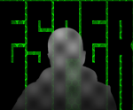
really ? thats funny, because i cant appreciate the first attempt for the logo really
there was too much trial and error involved
it looks a bit like marble or two thick colored liquids not properly mixed
Draconian wrote:
I agree with Erisian. The original background is nothing but a layer of Clouds>Solid Noise with some matallic curves applied. Your "fabric" looks much better. You can get rid of the small distortions by applying a bit more blur or using the GMIC Photocomix Smoothing filter.
Did you want to try and duplicate the chrome looking style in the original text exactly?
Well yes, the original goal was to recreate the template of the original record as much as possible, but my GIMP knowledge wasnt sufficient
if i cant achieve that, i try to, at least, recreate the basic style/feel that im going for
the quicksilver-esque logo of the second try looks better on a bigger scale
i make most of my coverart replicas in double size, so that got lost a bit after scaling down
Attachment:
 Hoax-Quicksilver-Logo.png [ 221.34 KiB | Viewed 2562 times ]
i will try the metalized Solid Noise technique later
at least i must know how to do it and try it once
any ideas how the original logo was done, Draconian ?