It is currently Sun Sep 06, 2026 5:15 pm


All times are UTC - 5 hours [ DST ]


Post new topic Reply to topic  [ 15 posts ] 
Author Message
 Post subject: Re: 'INTENSITY' Logo design
PostPosted: Sun Apr 07, 2013 5:28 am  (#11) 
Offline
Script Coder
User avatar

Joined: Oct 25, 2010
Posts: 4812
The first one is a really fun idea but it lacks a background.

Strange fact of the day: when you have your mouse over it, the "magnifying glass" pointer looks like a screw with a Phillips head:
Attachment:
ScrewingGlass.png
ScrewingGlass.png [ 5.62 KiB | Viewed 1789 times ]

_________________
Image


Top
 Post subject: Re: 'INTENSITY' Logo design
PostPosted: Sun Apr 07, 2013 10:02 am  (#12) 
Offline
Administrator
User avatar

Joined: Aug 10, 2012
Posts: 14193
Location: Native to NYC living in Arizona, Gimp 2.8 - 3.0, Win 11 PC.
Esper wrote:
well what can i say, this is just another proof that Wallace cant do anything bad, can he ?

everything he does looks so perfect :bigthup


@ESP,

Thanks a lot, you saying this really means a lot to me knowing how hard you work at creating your text based effects. ;)

_________________
Image
"A wise man learns more from a foolish question than a fool can learn from a wise answer"
Image


Top
 Post subject: Re: 'INTENSITY' Logo design
PostPosted: Sun Apr 07, 2013 10:38 am  (#13) 
Offline
Administrator
User avatar

Joined: Aug 10, 2012
Posts: 14193
Location: Native to NYC living in Arizona, Gimp 2.8 - 3.0, Win 11 PC.
ofnuts wrote:
The first one is a really fun idea but it lacks a background.

Strange fact of the day: when you have your mouse over it, the "magnifying glass" pointer looks like a screw with a Phillips head:
Attachment:
ScrewingGlass.png


That's an interesting mouse pointer. :hehe

I guess I could have added a wood texture as a background, but I wasn't asked to provide a background for any of the text images.

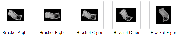
I did create a set of 'Custom Bracket Brushes'...

Custom Bracket Brushes

Image

And thanks to 'Sagethumbs', I now have viewable thumbnails of all the .gbr files on my Windows XP machine. :clap

_________________
Image
"A wise man learns more from a foolish question than a fool can learn from a wise answer"
Image


Top
 Post subject: Re: 'INTENSITY' Logo design
PostPosted: Sun Apr 07, 2013 10:42 am  (#14) 
Offline
Administrator
User avatar

Joined: Aug 10, 2012
Posts: 14193
Location: Native to NYC living in Arizona, Gimp 2.8 - 3.0, Win 11 PC.
molly wrote:
I like the second one the best, but the top one is so very interesting with the little gray things sticking out.


@Molly,

Those, 'little gray things' your referring to are the custom bracket brushes I made for the image.
View this post... viewtopic.php?f=11&t=6886&start=10#p86821

_________________
Image
"A wise man learns more from a foolish question than a fool can learn from a wise answer"
Image


Top
 Post subject: Re: 'INTENSITY' Logo design
PostPosted: Sun Apr 07, 2013 10:45 am  (#15) 
Offline
Administrator
User avatar

Joined: Aug 10, 2012
Posts: 14193
Location: Native to NYC living in Arizona, Gimp 2.8 - 3.0, Win 11 PC.
Thank you to everyone that commented and enjoyed these text images. :)

_________________
Image
"A wise man learns more from a foolish question than a fool can learn from a wise answer"
Image


Top
Post new topic Reply to topic  [ 15 posts ] 

All times are UTC - 5 hours [ DST ]


* Login  


Powered by phpBB3 © phpBB Group